Copyright Derek O'Reilly, Dundalk Institute of Technology (DkIT), Dundalk, Co. Louth, Ireland.
CSS masks currently only work with webkit browsers (Chrome and Safari).
A mask is used to hide portions of an element. A mask can be made using either an image, a gradient or text. When a mask is applied to an element, both the contents and background of the element are masked. A mask may be applied to the entire element or it may exclude either the border or both the border and the padding.
An image can be used as a mask. Non-transparent pixels in the image will act as the visible part of the mask. Transparent pixels in the image will act as a mask, blocking that part of the element from being displayed.
The colour of the non-tranparent pixels does not matter, as the mask is based solely on the alpha values of the pixels. The mask below is used in the following example.

Several CSS3 properties are not yet implemented on all browsers. The 'mask-box-image' is one such property. When a property is not yet fully supported across all browsers, we need to include a version of the property for each browser. The browser specific version of a property will always begin with a browser identifier and end with the property name. The browser specific version of the 'mask-box-image' property is:
We also need to to include the default CSS3 version of the property. This should always be listed after the browser specific versions of the property, as shown in the example below.
Example of an image mask (Run Example)
<!doctype html>
<html>
    <head>
        <title>Course notes example code</title>
        <meta http-equiv="Content-Type" content="text/html;charset=utf-8">
        <meta http-equiv="Content-Language" content="en" />
        <meta name="viewport" content="width=device-width, initial-scale=1.0">

        <style>
            img
            {
                -webkit-mask-box-image:url(images/dkit_transparent.png);
                -moz-mask-box-image:url(images/dkit_transparent.png);
                -ms-mask-box-image:url(images/dkit_transparent.png);
                -o-mask-box-image:url(images/dkit_transparent.png;
                mask-box-image:url(images/dkit_transparent.png);
            }
        </style>
    </head>

    <body>
        <img src = "images/dkit02.gif">
    </body>
</html>
Adjusting the alpha value of various pixel in an image will produce a mask that fades the display of the element using the mask.
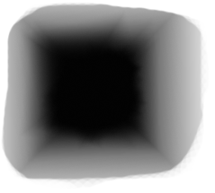
The faded image below is used in the following example.

Example of a faded image mask (Run Example)
<!doctype html>
<html>
    <head>
        <title>Course notes example code</title>
        <meta charset="UTF-8">
        <meta name="viewport" content="width=device-width, initial-scale=1.0">

        <style>
            img
            {
                -webkit-mask-box-image:url(images/faded_image.png);
                -moz-mask-box-image:url(images/faded_image.png);
                -ms-mask-box-image:url(images/faded_image.png);
                -o-mask-box-image:url(images/faded_image.png);
                mask-box-image:url(images/faded_image.png);
            }
        </style>
    </head>

    <body>
        <img src = "images/dkit02.gif">
    </body>
</html>
Change the flex image gallery here, so that a mask is applied to each image, as shown here.
Change the code in the above example, so that multiple different faded image masks are used, as shown here.
Masks can be combined with other CSS styles. Create your own faded image mask in pixlr (or any image editing software) and use it to display an image on a background that has a circular gradient, as shown here.
Using the logo of a company as a mask, draw an image, as shown here.
More than one mask can be combined to create visually interesting results. Write code that uses two masks to display the multicolour text shown here. Hint:You will need two masks:one for each of the two triangles.
A gradient mask is created by fading a gradient from black to transparent, where Black means fully visible.
Example of a gradient mask being applied to an image (Run Example)
<!doctype html>
<html>
    <head>
        <title>Course notes example code</title>
        <meta charset="UTF-8">
        <meta name="viewport" content="width=device-width, initial-scale=1.0">

        <style>
            img
            {
                -webkit-mask-box-image:-webkit-linear-gradient(black, transparent);
                -moz-mask-box-image:-webkit-linear-gradient(black, transparent);
                -ms-mask-box-image:-webkit-linear-gradient(black, transparent);
                -o-mask-box-image:-webkit-linear-gradient(black, transparent);
                mask-box-image:-webkit-linear-gradient(black, transparent);
            }
        </style>
    </head>

    <body>
        <img src = "images/dkit02.gif">
    </body>
</html>
A gradient mask can be applied to text in exactly the same way as it is applied to images. Write code to apply a gradient mask to text, as shown here.
By using rgba instead of "black" as the gradient colour, we can exert more control over a mask's visibility. An rgba alpha value of 1 is fully visible and an rgba value of 0 is fully masked. any value between 0 and 1 will exert a degree of masking. Note, that the red, green and blue values given in the rgba are ignored for the purpose of masking.
Example of rgba gradient mask (Run Example)
<!doctype html>
<html>
    <head>
        <title>Course notes example code</title>
        <meta http-equiv="Content-Type" content="text/html;charset=utf-8">
        <meta http-equiv="Content-Language" content="en" />
        <meta name="viewport" content="width=device-width, initial-scale=1.0">

        <style>
            div
            {
                width:650px;
                background-color:yellow;
                color:red;
                font-size:300px;

                -webkit-mask-box-image:-webkit-linear-gradient(left, transparent 0%, rgba(1, 1, 1, 0.5) 50%, transparent 100%);
                -moz-mask-box-image:-webkit-linear-gradient(left, transparent 0%, rgba(1, 1, 1, 0.5) 50%, transparent 100%);
                -ms-mask-box-image:-webkit-linear-gradient(left, transparent 0%, rgba(1, 1, 1, 0.5) 50%, transparent 100%);
                -o-mask-box-image:-webkit-linear-gradient(left, transparent 0%, rgba(1, 1, 1, 0.5) 50%, transparent 100%);
                mask-box-image:-webkit-linear-gradient(left, transparent 0%, rgba(1, 1, 1, 0.5) 50%, transparent 100%);                       }
        </style>
    </head>

    <body>
        <div>DkIT</div>
    </body>
</html>
Text can be used to mask an image, as shown in the example below. This is done by placing the image onto the background and clipping the element's displayable area against the text.
Example of text mask for an image (Run Example)
<!doctype html>
<html>
    <head>
        <title>Course notes example code</title>
        <meta charset="UTF-8">
        <meta name="viewport" content="width=device-width, initial-scale=1.0">

        <style>
            #mask
            {
                font-size:300px;
                color:transparent;
                background:url(images/dkit02.gif);

                -webkit-background-clip:text;
                -moz-background-clip:text;
                -ms-background-clip:text;
                -o-background-clip:text;
                background-clip:text;
            }
        </style>
    </head>

    <body>
        <p><span id = "mask">DkIT</span></p>
    </body>
</html>
Write code to place a drop shadow on a text mask, as shown here.
Copyright Derek O' Reilly, Dundalk Institute of Technology (DkIT), Dundalk, Co. Louth, Ireland.