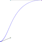
ease
(0.25, 0.1), (0.25, 1)
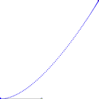
ease-in
(0.42, 0), (1, 1)
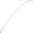
ease-out
(0, 0), (0.58, 1)
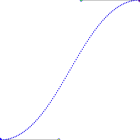
ease-in-out
(0.42, 0), (0.58, 1)

linear
(0, 0), (1, 1)
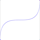
cubic-bezier
(0, 1), (1, 0)
Copyright Derek O'Reilly, Dundalk Institute of Technology (DkIT), Dundalk, Co. Louth, Ireland.
Transitions control the speed at which an element changes its CSS state. Transitions are most commonly associated with the change to and from the ":hover" state.
To use a transition add the:
The example below scales an image when the mouse hovers over it.
Example of basic transitions (Run Example)
<!doctype html>
<html>
    <head>
        <title>Course notes example code</title>
        <meta charset="UTF-8">
        <meta name="viewport" content="width=device-width, initial-scale=1.0">

        <style>
            img.smooth
            {
                transition:0.5s;
            }

            img:hover
            {
                transform:scale(1.5);
            }
        </style>
    </head>

    <body>
        <img src = "images/dkit04.gif">
        <img class = "smooth" src = "images/dkit04.gif">
    </body>
</html>
In the example below, the image on the left has a delayed start.
Example of delayed start transition (Run Example)
<!doctype html>
<html>
    <head>
        <title>Course notes example code</title>
        <meta charset="UTF-8">
        <meta name="viewport" content="width=device-width, initial-scale=1.0">

        <style>
            img.delayed
            {
                transition:0.5s;
                transition-delay:1s;
            }

            img.smooth
            {
                transition:0.5s;
            }

            img:hover
            {
                transform:scale(1.5);
            }
        </style>
    </head>

    <body>
        <img class = "delayed" src = "images/dkit04.gif">
        <img class = "smooth" src = "images/dkit04.gif">
    </body>
</html>
A transition can be limited, so that it only applies to some of the CSS effects that result from a change in state of an element. In the example below, the first image is limited to only apply to the scaling of the image. The second image uses the transition for both the scaling and opacity.
Example of a limited transition (Run Example)
<!doctype html>
<html>
    <head>
        <title>Course notes example code</title>
        <meta charset="UTF-8">
        <meta name="viewport" content="width=device-width, initial-scale=1.0">

        <style>
            img.smooth
            {
                transition:5s; /* All the transitions will be applied to images of class "smooth" */
            }

            img.limited
            {
                transition:transform 5s; /* Only apply the transform transition to images of class "limited" */
            }

            img:hover
            {
                transform:scale(1.5); /* both images will use a transition for the transform */

                opacity:0.2;          /* The img of class "limited" will not use a transition for opacity. Instead, it will change opacity immediately */
            }
        </style>
    </head>

    <body>
        <img class = "limited" src = "images/dkit04.gif">
        <img class = "smooth" src = "images/dkit04.gif">
    </body>
</html>
By default, transitions start slowly, then speed up and finally end slowly. Various timing options can be applied to a transition.
A graph of (time, speed) for each of the various transitions is shown below.
 ease (0.25, 0.1), (0.25, 1) |
 ease-in (0.42, 0), (1, 1) |
 ease-out (0, 0), (0.58, 1) |
 ease-in-out (0.42, 0), (0.58, 1) |
 linear (0, 0), (1, 1) |
 cubic-bezier (0, 1), (1, 0) |
The example below shows the use of the various timing functions. An interactive timing function diagram is available at this link.
Example code for various transition timing functions (Run Example)
<!doctype html>
<html>
    <head>
        <title>Course notes example code</title>
        <meta charset="UTF-8">
        <meta name="viewport" content="width=device-width, initial-scale=1.0">

        <style>
            div
            {
                width:200px;
                text-align:center;
                display:inline-block;
            }

            img
            {
                width:100%;
                transform-origin:0 0;

                transition:2s;
            }

            img.ease
            {
                transition-timing-function:ease;
            }

            img.ease_in
            {
                transition-timing-function:ease-in;
            }

            img.ease_out
            {
                transition-timing-function:ease-out;
            }

            img.ease_in_out
            {
                transition-timing-function:ease-in-out;
            }

            img.linear
            {
                transition-timing-function:linear;
            }

            img.cubic_bezier
            {
                transition-timing-function:cubic-bezier(0, 1, 1, 0);
            }

            img.steps
            {
                transition-timing-function:steps(10);
            }

            img:hover
            {
                transform:scaleY(5);
            }
        </style>
    </head>

    <body>
        <div>
            <p>ease</p>
            <img class = "ease" src = "images/dkit04.gif">
        </div>

        <div>
            <p>ease-in</p>
            <img class = "ease_in" src = "images/dkit04.gif">
        </div>

        <div>
            <p>ease-out</p>
            <img class = "ease_out" src = "images/dkit04.gif">
        </div>

        <div>
            <p>ease-in-out</p>
            <img class = "ease_in_out" src = "images/dkit04.gif">
        </div>

        <div>
            <p>linear</p>
            <img class = "linear" src = "images/dkit04.gif">
        </div>

        <div>
            <p>cubic-bazier</p>
            <img class = "cubic_bezier" src = "images/dkit04.gif">
        </div>

        <div>
            <p>steps</p>
            <img class = "steps" src = "images/dkit04.gif">
        </div>
    </body>
</html>
Transitions can be written in shorthand as:
transition [css_property] duration timing_function delay
In the example below, both images behave the same way.
Example of transition shorthand (Run Example)
<!doctype html>
<html>
    <head>
        <title>Course notes example code</title>
        <meta charset="UTF-8">
        <meta name="viewport" content="width=device-width, initial-scale=1.0">

        <style>
            img.separate
            {
                transition:0.5s;
                transition-timing-function:linear;
                transition-delay:1s;
            }

            img.shorthand
            {
                transition:0.5s linear 1s;
            }

            img:hover
            {
                transform:scale(1.5);
            }
        </style>
    </head>

    <body>
        <img class = "separate" src = "images/dkit04.gif">
        <img class = "shorthand" src = "images/dkit04.gif">
    </body>
</html>
Write code to cause an animated image transition when the user moves the mouse over an image, as shown here.
Adjust the example here, so that transitions are added to the hover events, as shown here.
Copyright Derek O' Reilly, Dundalk Institute of Technology (DkIT), Dundalk, Co. Louth, Ireland.